When you give presentations you might need to describe graphs. You also need to describe graphs in TOEFL and IELTS tests sometimes.
Bar Charts
Let’s look at bar charts first. This is the most common type of graph to appear on tests and in business or news media.
It’s normal to compare the figures for different years or different products. It’s best to use comparatives (‘higher than’, ‘lower than’) and superlatives (‘the highest’, ‘the lowest’).
We might describe this bar chart as follows:
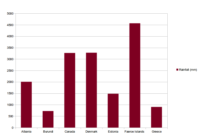
The Faeroe Islands have the highest rainfall, over 4500 mm, whereas Burundi has the lowest at around 700 mm; The Faeroe Islands have approximately six times the amount of rain as Burundi. Canada and Denmark have roughly equal amounts of rainfall, approximately 3200 mm, while Albania, Estonia and Greece have roughly 2000 mm, 1500 mm and 900 mm respectively.
Line Graphs
Line graphs usually describe trends or changes. With these, it is quite common to use different words to describe increases or decreases.
| increase | decrease |
|---|---|
| go up | go down |
| grow | diminish |
| rocket | plunge |
| climb | drop |
| develop | fall |
These changes can be used with adverbs to describe magnitude of change.
| strongly | weakly |
|---|---|
| significantly | slightly |
| aggressively | gently |
| dramatically | negligibly |
You can also describe the graph staying the same using the verb phrases ‘remain unchanged’ or ‘remain constant’.
Small changes up and down are called ‘fluctuations’.
We can describe this graph as follows:
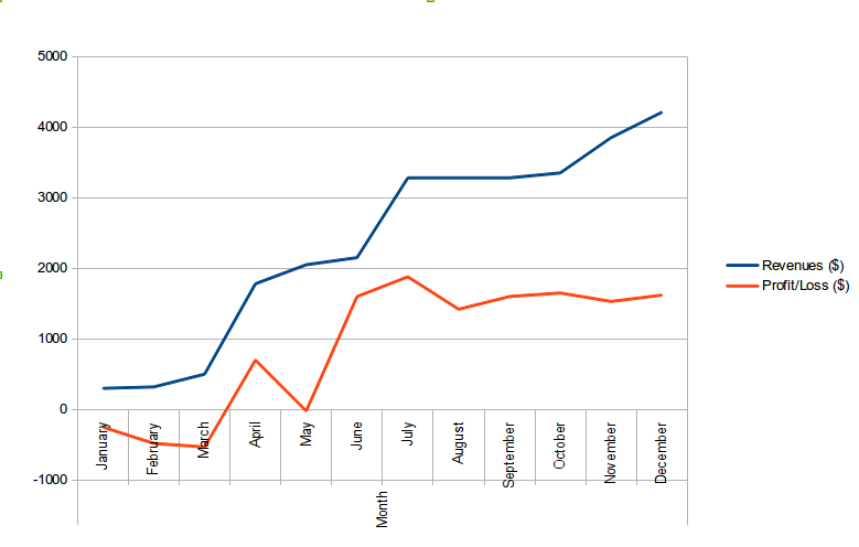
The revenues increase slightly over the first quarter (January to March) while there is a developing loss. Between March and April revenues increase significantly and there is a profit to correspond with this. The growth slows between April and June and there is also a fluctuation in profit. The revenue has an upwards trend though this plateaus in Autumn and goes up once more in November, albeit less dramatically than previous increases. Profit also plateaus and shows negligible fluctuations throughout the final quarter of the year.